Wednesday, 23 July 2008
Sincere apologies

Wednesday, 25 June 2008
Brief intro into Photojournalism
The joy of being involved in a part-time journalism/photojournalism role is that the burden of deadlines isn't always looming. I've been exposed to this field for the last two years and it has been a good experience, assisting my self-development in photography.
However a distinction should be made between being a photographer and a photojournalist. The difference is subtle, but distinguishable. Let's use a parallel in terms of grammar. A photographer looks for shapes, textures, colour, the subject – essentially the capturing of nouns. The photojournalist looks to capture actions, a story – verbs. And this difference between nouns and verbs is that subtle feature between the two.
Capturing verbs isn't easy; some moments are spontaneous and could be missed if under- or unprepared. This of course adds to the pressure on delivering images that the editors can use for their stories. So what can be done to increase the chance of capturing these brief moments and also a narrative? I guess it comes back to one of my basic philosophies (and it was heavily repeated in the past post on Weddings): preparation.
Preparation here has to be meticulous if the event is of high significance. Let's take a protest as an example. The location has to be sourced and if there's going to be a march, then the planned route should be researched and then scouted for potentially good viewpoints. As with outdoor events, the weather will play a factor, and so the forecast should be looked up and that may determine what gear could be in your kit bag. Other things to consider is police presence. Major protests will of course have police presence, and if you're aiming to cover the events for publication then seeking a press pass will assist greatly. On early arrival for the event, make your presence known to the police and see if they have any pointers on potential spots for trouble – this could provide further opportunities for images.
The last part is liasing with the writer of the story (unless it happens to be yourself as well). If there is a particular take on the story, this may influence what types of images the editors might want to fit in with the writing. However this doesn't mean that the photographs have to all fit this particular angle. There may be an image that you capture that opens an entirely new direction for the article.
Once the images are captured, they then need a short descriptive line, known as a cutline. This essentially can be structured as follows:
[noun] [verb] [direct object] during [event] at [venue] in [city/ geographical location] on [day of the week], [date], [month], [year]. Reason for why or how this happened.
The images once captioned are either fed through an FTP, emailed or dropped into the office. Very little editing is ever done to the images (for the fear of misrepresention). The turn round time here varies from publication to publication from hours to days.
And there we have a glimpse into photojournalism.
Monday, 16 June 2008
The tilted perspective
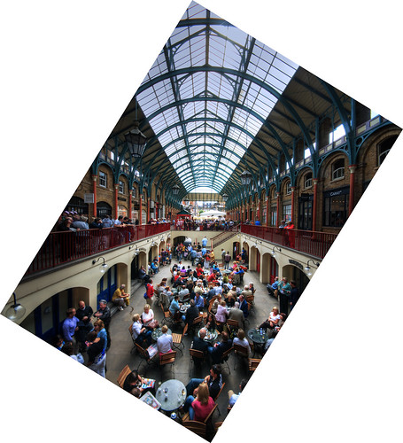
Here is the same image again from a tilted perspective.
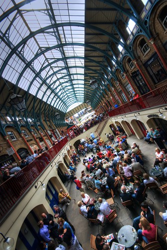
Now those leading lines are all in a different configuration. The two bannisters still pull the eye towards the distance, but now we have the asymmetry that also is pulling on the eye. The brown brickwork and the glass roof make the top half a very contrasting part of the frame. I used this to create a powerful line because of this contrast - the eye is more taken by the glass roof which leads to the distance. The bottom left of the frame is aligned with the bannister to create a second line. To top it off the degree of tilt was determined by aligning the transistion at the top between the glass and the brickwork so that it formed a vertical line downwards. What this does is create an impression that the market hall could be longer than it is in real life because of the exaggerated lines. Now one example isn't enough, so here's another:

So the theme I hope I've established is that the tilt isn't something that can be haphazardly used. You need at least 2 leading lines, if not more, for this perspective to work strongly. It's preferable to have the centre of the frame as the point where these lines converge, though it doesn't have to be the case from time to time. Again I'll illustrate this.

Here is an image of St Pancras Railway Station. The leading lines from the bannister and roof are similar to the one above from Covent Garden but the tilt here is noticeably less and also to the other direction. You might be asking why - and that's down to the odd leading line of the escalator. This doesn't lead to the centre of the frame, but to the bottom third. What this can add is another line of interest to the image.
We've now identified what needs to be there for tilting - leading lines to a focal point. But how can we tell when is a good opportunity to tilt, and then how much to tilt it by?
The answer is simple - experience and interest. We view the world from a horizontal perspective; as photographers we seek different perspectives - hence the suggestions of lying low or climbing high for that difference from eye level. What we sometimes neglect is that at eye level we can also tilt for that difference. Composition doesn't have to follow the basic rule of thirds as we're manipulating converging lines instead. And it's the convergence that tells us the tilt. Strongly convergent lines like the market hall can give greater scope for tilting, whilst gentler lines as in the railway station accommodate for less.
In the end it comes down to experimentation. Often a little trial and error to find the right angle is needed, and to find that different perspective that we don't often see every day. Good luck!